Kitchen colour inspiration: trying out trends and knowing the safe bets
The colour of your kitchen is super important when it comes to creating the ambience you want. What personality do you want the heart of your home to have? The palette you choose will have an influence not only on people’s mood and feelings of well-being, but also on their perception of the size of the space. So let’s take a closer look at what colours can do for your kitchen!
It’s not just the colour of the walls you have to consider. There’s also the kitchen furniture, countertops, cabinets and accessories to take into account when dreaming up your perfect ambience. Keep in mind that dynamic, warm colours can give life to the entire room or wake up a wall or a particular area. On the other hand, cool tones set a peaceful mood and give a sense of elegance to a kitchen. With savvy colour choices, you can make your kitchen appear bigger, demarcate it from an adjoining room or bring up or down its brightness.
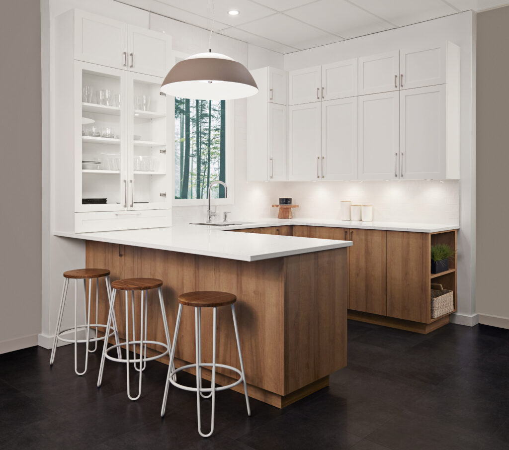
A pure, immaculate kitchen
White is a favourite colour for plenty of reasons, and it’s always a safe bet. Not only does it go with everything, it brings out the best in natural wood and guarantees a bright, timeless kitchen. If you want a bit of colour, consider other neutral choices. Light shades, greys and beige are excellent choices for a contemporary kitchen.

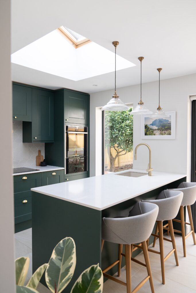
Chic, peaceful colours
If it’s colour you’re looking for, you may want to head in the direction of blues and green greys. Petrol blue is timeless, sophisticated and sober, and it complements white, grey and wood magnificently. The elegance of navy blue or royal blue pairs marvelously with light shades, wood, beige and taupe.
If you’re a nature-lover, consider shades of olive, rosemary and forest to give your kitchen a touch of stylish, natural serenity. These colours go particularly well with light wood or white finishes, not to mention brass accessories.
How do we colour your world?
At Groupe 3R, we start by offering you a neutral palette from which you select two shades. If you’re leaning toward colourful, then it’s better to limit yourself to one choice. You’ll use it as a principal colour for the entire room or to bring out the kitchen’s neutral tones.
You might also want to go for a lively, saturated colour in just one part of the room to give it a peppy assertive vibe. Another tip: when it comes to the finish of your paint, mat is the current trend.
Once you have your colour scheme, it’s time to explore materials. Note that colours are not limited just to walls, especially if you’re looking for more contrasty shades. Consider the colours of the backsplash, the bottom part of the room, accessories and household linen — the possibilities are endless.
The key: context
Several factors need to be looked into to make insightful decisions about colour. You need to first take into account both the kitchen lighting and the natural daylight. Lighter colours are best in darker rooms, while kitchens bathed in sunlight can benefit from gentle, cooler colours and accommodate darker tones.
In a closed space, you will generally use just one colour in all of the room. In open kitchens, you obviously also have to consider the surrounding space. You could, for example, use colour to demarcate the space by painting a part of the ceiling.
And don’t forget other kitchen elements when it comes time to arrange the colours: floors, countertops, furniture and appliances are all part of the palette.
![]()
Some mistakes to steer clear of
To make sure your dream kitchen stands the test of time, there are also some things you should avoid. If you’re opting for bright colours, stick to just one shade to avoid headaches. Same goes for the species of wood: they shouldn’t be mixed together. And colours that are too similar can appear to be faded paint or look like a painting mistake, so make sure to go for shades that are truly distinct from one another. Finally, black is less and less popular for several reasons. It appears dirty, can feel oppressive and darkens a closed kitchen too much.